Fun with JavaScript and Device Orientation


There’s some new “black magic” in the world of JavaScript… and its name is “device orientation”. This emerging feature allows JavaScript to monitor the physical orientation of the current device. This is not to be confused with the orientationchange event, which triggers when mobile devices change from portrait to landscape views and vice versa. No, instead, this means I can tilt my computer or phone or tablet and have JavaScript do stuff based on the way I’ve tilted it.

Euler Angles

For a “wow” effect, take a look at this (ugly) demo I quickly whipped upworks on modern browsers only. There is a lot of ugliness in that code, but the idea is there. I can perform a physical action (tilt my computer) and interact with the virtual content in an intuitive way. Very satisfying.

How do I do this?

Firstly, I should point out the awesome article about device orientation on html5rocks. It’s got enough to get you started. Basically the idea is you subscribe to a deviceorientation event using document.addEventListener(). The event will pass along some information about the device’s current orientation. Results will vary depending on the device and the browser.

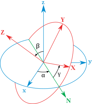
The information you can possibly have access to includes information from the accelerometer (tilt of the device) and compass information (direction on the earth). If you are familiar with Euler angles, then that will help. The information that the event passes back is essentially the Euler angles. Here’s a video showing a quick demo of what Euler angles measure.

In my jsFiddle above, what I’m doing is monitoring the angle gamma which corresponds to the left-right tilt of your device. Once I have that angle, I use some easy trigonometry to figure out the horizontal and vertical acceleration of virtual gravity relative to the viewport.

Still interested? Ok. data.lr * Math.PI / 180 converts the angle from degrees to radians so that I can put it into sin() and cos(). Those in turn, give me the amount of gravity in the horizontal and vertical directions when I multiply them by my total (virtual) gravity.

ay = a * Math.cos(data.lr * Math.PI / 180);
ax = a * Math.sin(data.lr * Math.PI / 180);

Free code, anyone?

I’ve been playing around with this device orientation voodoo for a little while and decided to write some AMD modules to make my life easier. One of them basically copies the code from html5rocks. The other (called device-gravity) gives you the projection of gravity along your device. It will give you the magnitude, angle, and x and y components.

“Projection of gravity? What does that do?”

I’m glad you asked. Imagine placing your laptop or tablet down on a level surface. Now place a ball on it. Right now – if the surface is very level – the ball won’t move. That means the projection of gravity is zero along the surface of your device. In other words, gravity points directly into the surface of your device. If you tilt your device, then the ball starts to accelerate. The projection of gravity along your device is the direction the ball moves, and the magnitude of the projection is the amount at which it accelerates.

Maybe a little demo is in order. This demo shows a projection-o-meter that shows you the projection of gravity. It also shows another example of what you can do with device orientation.

The code and documentation is on GitHub. Feedback is most welcome.

A Responsive JavaScript Event Binding Method


I’ve recently been doing a lot of responsive web development work. I was building a component that could have several different states depending on the size of the viewport. Each of these states dictated different user interaction. For example, a mouse move interaction in one state could turn into a mouse click interaction in another. So what I needed was a way to easily activate and deactivate JavaScript events depending on the viewport size.

One way to do this (that isn’t so pretty) would be to monitor the viewport size and unbind and rebind the appropriate events between certain viewport size breakpoints. Similarly, you could manually add if() statements in the event callbacks to only use the callback if the breakpoint was the correct one. Neither of these solutions seemed easy enough to manage for me, so I came up with a more elegant solution.

The solution I came up with uses the window.matchMedia() method and jQuery 1.7 .on() event delegation. The idea in a nutshell is to add a listener to a media query using matchMedia() and add a classname corresponding to the state of your component. Then by delegating events based on that state classname the events will automatically be disabled when that classname changes.

First, let’s start with some very simple HTML markup:

<div id="my-component">
    <div class="inner">
        <div class="call-to-action">
            Do Stuff...
        </div>
    </div>
</div>

So here #my-component is the main container of your component, .inner is an inner wrapper that we are going to add the state class names to, and .call-to-action is what we’ll be expecting interaction events from. Now lets go to the javascript and define some states:

var breakpoints = {
    bp1: 'screen and (min-width: 0px) and (max-width: 320px)',
    bp2: 'screen and (min-width: 321px)'
    //etc...
};

So here we have two states. The first will be active in a viewport with a width less than 320px and the second will be active in widths larger than 321px. What we need to do now is use matchMedia to listen for these viewport changes and in the callback add a class name to the .inner element which corresponds to the currently active state. We do this by using the .addListener() method.

for ( var name in breakpoints ){

    // need to scope variables in a for loop
    !function(breakName, query){

        // the callback
        function cb(data){
            // add class name associated to current breakpoint match
            $( '#my-component .inner' ).toggleClass( breakName, data.matches );
            // potentially do other stuff if you want...
        }

        // run the callback on current viewport
        cb({
            media: query,
            matches: matchMedia(query).matches
        });

        // subscribe to breakpoint changes
        matchMedia(query).addListener( cb );

    }(name, breakpoints[name]);
}

Now whenever we change between these viewport ranges the .inner element will have a class name of either .bp1 or .bp2. All we need to do now is delegate the events we want based on these class names. To do this we use jQuery’s .on() with a query string that scopes the .call-to-action within either .bp1 or .bp2, like so:

$( '#my-component' )
.on({

        //click events
        click: function(e){ 
            $(this).html('You clicked');
        }

    },

    //query string to match .call-to-action but only in first breakpoint
    '.bp1 .call-to-action'
)
.on({

        //mouse events
        mouseenter: function(e){
            $(this).html('You mouseentered');
        },

        mouseleave: function(e){ 
            $(this).html('You mouse...left...');
        }

    },

    //query string to match .call-to-action on all EXCEPT first breakpoint
    '.bp2 .call-to-action'
);

And voila. Now these event callbacks will automatically only work inside their appropriate breakpoints. Adding more events or breakpoints becomes very easy to manage.

Note: Unfortunately there are a few problems with the window.matchMedia() implementation, as Nicholas C. Zakas outlines in his informative article. Fortunately, in the same article, he provides a solution to these problems through the implementation of a YUI module… which can easily be ported to jQuery or anything else. In future I’ll provide a jQuery implementation based on Zakas’ code.

Here’s a jsFiddle of the above code so you can see how it works. I have used Zakas’ fixes for firefox, so there are a few lines of extra JS in there to deal with that. Try resizing the result screen and clicking and mousing over!